‘What’s Your Vibe’ Web App
Ann Summers:
A finalist for ‘Excellence in Customer Experience’ at the Retail Tech Awards.
During my time working at Biglight, we raised the hypothesis that users of the Ann Summers site were struggling with too much choice in the vibrators category.
Project success in summary:
8%
Increase in mobile conversion
300%
3x uplift in the target revenue
1000%
10x overall return in investment
“It’s different, I’ve not seen anything like that – not with all the info it gives you”
A customer during our user testing session
The original problem:
The Vibrators Product Listing Page was seeing a high traffic volume, with a long dwell time and a high exit rate. Similarly, the bounce rate was high for landing traffic.
We hypothesised that decision paralysis was to blame: interest was high in this category that the brand was renowned for, yet users were becoming overwhelmed with choice.
With often over 100 products in this category, the filter options left users feeling not ‘expert’ enough in this category to move forwards.
The process:
I worked collaboratively with a UX researcher, a developer, and a copywriter, as well as directly with the product team at Ann Summers to gain insights into the USPs of each vibrator.
We noted the filter categories with the highest engagement (size, intensity, vibration style and shape) and set about finding a solution that would guide users to not only come to understand their tastes and preferences, but to ultimately make a decision in the categories that actually mattered to them.
The solution:
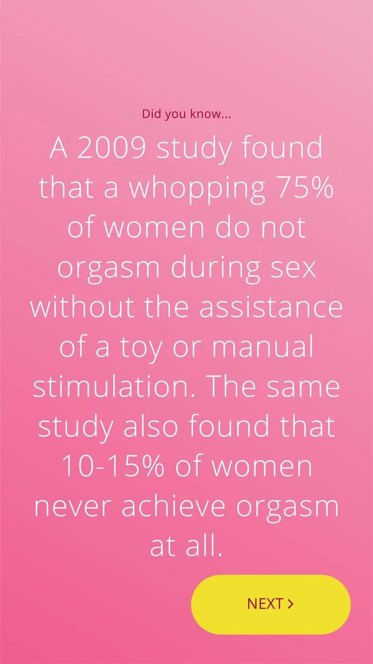
With the aim to create something that a) felt accessible to all (rather than only to seasoned buyers), and b) aided decision paralysis, we created a quick-to-use product finder. This tool focused the user’s mind on one preference at a time, whilst peppering the journey with snackable content, tips and facts.
Illustrations, animations and haptic feedback (in the form of pulse vibrations when using a mobile device) all contributed to create a more sensory experience that could better guide the user. Furthermore, the background colour of the UI also changed to reflect increasing intensity or size.
Selecting your preference in each category was optional, with users only being required to select a single preference in order to benefit from a personalised recommendation. A dynamic product counter was displayed throughout the journey so that users could opt to browse products when the selection on offer felt less overwhelming.
Testing the concept:
We brought in prospective customers to test a MVP to understand a) if our hypothesis was correct, and b) if the tool helped to resolve this.
The feedback was resoundingly positive:
“It’s different, I’ve not seen anything like that – not with all the info it gives you”
“I like this, it’s fun”
“It’s really interesting, almost starts to get you in the mood!”
After taking on board user feedback and reworking the hierarchy of the progression components of the original UI, the product went live on an A/B split (50% seeing the tool, 50% seeing the control).
The success:
The Ann Summers product team set the success measures as being: mobile conversion on the vibrator category, as well as a target revenue figure.
After two months of launching, the data showed an 8% increase in mobile conversion and 300% uplift in the target revenue.
The brand also saw a 10 x overall return in investment.
Externally, this project was a finalist for a Retail Tech Award for Excellence in Customer Experience, which recognises work right at the cutting edge of retail innovation. Specifically, the judges were looking for innovations that “made the shopping experience more convenient, rewarding or inspiring.”


